Title - Strangers Brewing Co.
Client - Strangers Brewing Co.
Year - 2021
Discipline - Logo, branding & bespoke typeface
Logo design, branding and bespoke typeface for Strangers Brewery in Linlithgow, Scotland.
Approached by the micro-brewery's founder to brand the community lead brewery, they knew they wanted a timeless and classic. Not a bang-on-trend, quickly dated hipster logo. With foraged ingredients and updates of classic beer styles plus a plan to unite the community and make strangers into friends, they knew gimmicks or flare graphics wouldn't work. Creating a brand mark along with a type lead art direction to help tell their story was the crux of their brief.
Given the name, taken from the town's patron Saint, St Michael (who was kind to strangers) we felt that landing a sense of place was crucial to the brand. Getting this in there would not only help land the brand names' origin and their ethos but to also ground it within the community.
Having researched local history and iconography, several landmarks and local stories kept on cropping up from the town's unofficial mascot, the Black Bitch, to church ornaments and local statues. The starting point proved to be creating the bespoke typeface to emphasise something unique and act as lead into sense of place. Inspired by the local monument (see below), the typeface adopted many of the idiosyncracies of the original stone carvings. Subtle deviations between stem widths, loops, lobes and serfis became key to the design. Again, as per the brief, acting as signifier to the location and history (as well as a direct link with this statue to the origin of the brand name) was something we felt was key. Coupled with the spire from the church within the brand mark, all helped to show that the brewers' understand the importance of the heritage of the region and not just co-opting/ cashing in with these subtle but identifiable elements from the region.
Part of the delivery included a brand book showing usage as well as do's and don'ts for the logo and bespoke typeface. Shown above is one of those examples, a poster mock up for a hypothetical fundraising event.
Type research and development.
Designed as a Display typeface, the idiosyncracies adopted from the original stone carving, as well as the spacing between the letters and words become less pronounced and harder to see but crucially add to the feel of the brand as something unique and classic.
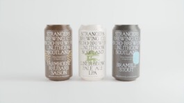
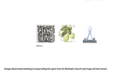
Brand Mark & support logos for use across different brews or communications.
Brew mark development and (below) part of the original brief.
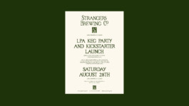
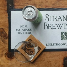
After a hugely successful kickstarter campaign the brewery is in full swing with many community projects due to start soon.
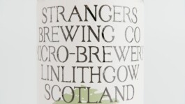
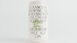
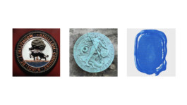
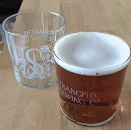
Logo and brand mark in use at the brewery.
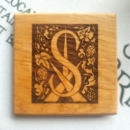