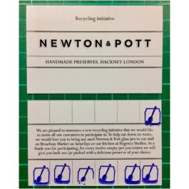
Title - Newton & Pott
Client - Newton & Pott
Year - 2012
Discipline - Branding & Packaging design
Branding and packaging design for the London based artisan preserving company.
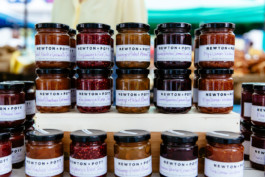
Kylee, the founder speculated that the produce sing inside the jar, that you could see the amount of fruit (through the seeds) packed into each jar. So many of the rival companies packaging at time dominated the exterior of each jar and left little room to see what was inside. That, and given the brand's ethos (unique and modern flavour combinations using age old preserving techniques) we decided to look into old shop signage we'd seen around the city. Long and thin, often with dividing panels between window panes, the format offered up the perfect structure to house all the information needed per jar. Adding the hand written flavour to each jar (admittedly a chore for many years for the brand) it reinforced the handmade nature of each and every product.
The brand went on to retail across Europe and the Uk including clients such as Harrods, Harvey Nicols and Selfridges as well in dozens of exclusive delis and shops.
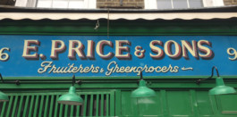
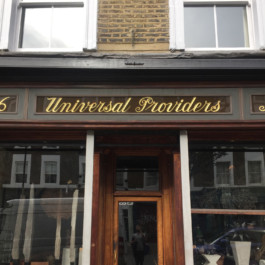
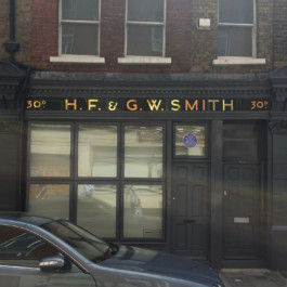
Initial references.
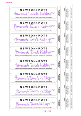
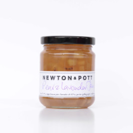
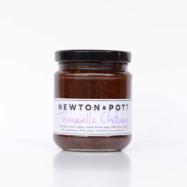
An example of the many 'lines' the brand had to write when jarring.
Label design evolution over a 4 year period. Initial refinement as well as scale tweaks and legal requirements as the company grew and expanded.
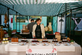
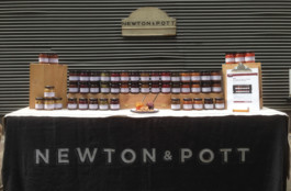
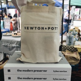
Brand application over the years - Market stall pitch, 2013 & 2016.
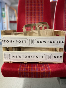

Additional brand marks across various platforms.
