ADMINISTRATION

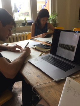
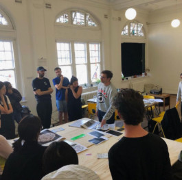
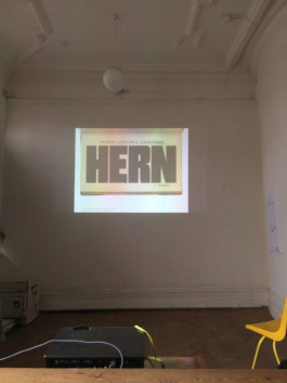
Set by Paul Barnes of Commercial type, this module at the Typography Summer School involved recreating older archived typefaces from references he'd found whilst researching Commercial classics. In this case a condensed slab typeface that we estimated to be early to mid 19th Century. We were lucky enough to have quite a long word so it came together quite quickly. Paul joked at the time that it was very much on the vein of a college varsity logo and re-titled it 'The Mighty Ducks'.
ABCDEFGHIJKL
MNOPQRSTUV
WXYZ
THE MIGHTY DUCKS
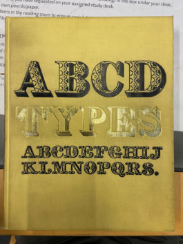
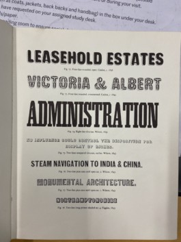
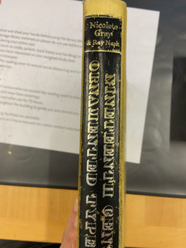
I subsequently found the source of Paul's reference whilst thumbing through some of Nicolette Gray's reference books as St.Brides library.
At the time I think we thought it might be a touch earlier but were pleased to be close enough to the mark. Plus with a little more information St Brides were able to find the original specimen book from their archive for me. Such an incredible resource.


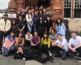
Typography Summer School 2019